How To Makeover a Middle School Syllabus Using Canva
Using Canva to Create Awesome Educational Designs
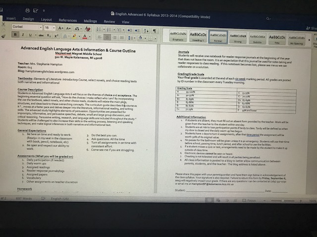
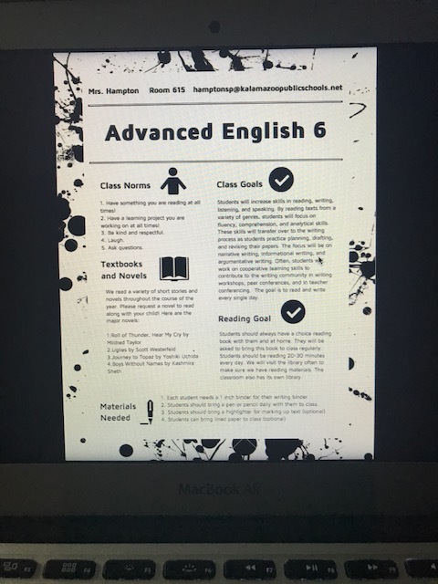
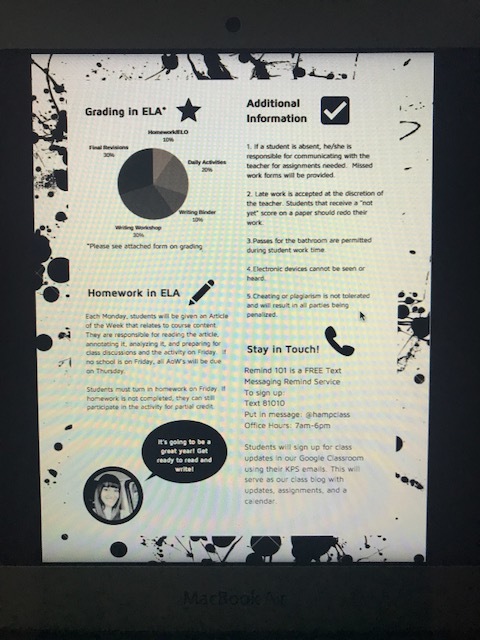
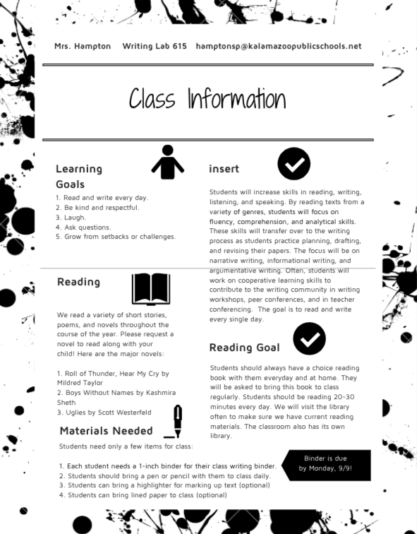
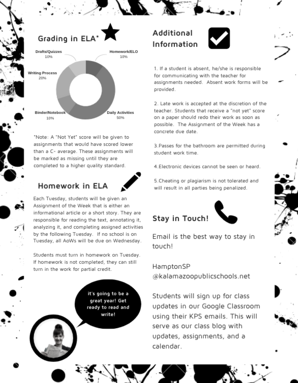
The fall inevitably brings about the desire and need to change and update your course syllabus. A syllabus is something that is often debated in the English classroom because the crux of the syllabus is really the organization of how the class will run overall. You get information about the materials, the grading practices, and a course schedule. While middle schoolers are brand new to the idea of a course syllabus, high schoolers and college students come to expect this piece of paper on the first day of class. This post shows you some ways to create an engaging document using the computer program Canva. I have included pictures of my old syllabus and what my syllabus looked like in the 2019-2020 school year. If you choose to use Canva, you can make an amazing syllabus using the free version of the program. I personally pay for the upgraded program to get access to pictures, watermark features, downloading features, and more.
Common Mistakes
Before we jump into the program and the design of the document, let’s address some common mistakes that happen when handing out a syllabus. Here are the top five non-intentional ways to use a syllabus that I have done in the first ten years of teaching.
Mistake #1: You don't get your syllabus signed by students and/or families.
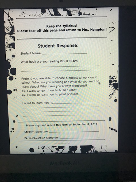
When I first started, I didn't have any form of accountability on my end for making sure that both parents/guardians and students acknowledge they have read the syllabus. I added this in and then I automatically had another checkbox on my end for when working with parents regarding communication. You didn't know my email? Did you see the syllabus? CHECK. You didn't know I don't take work a week after the due date? CHECK. Need the Remind App information? Need to know the grade breakdown? Need directions for google classroom? CHECK. CHECK. CHECK.
Mistake #2: You read the syllabus to them in class or don't read it at all.
I never experienced activities with the syllabus in my education, and I don't hear often the activities that other educators do with their syllabi. However, I have heard more and more about "syllabus scavenger hunts" and stations that involve looking over the syllabus. This hits one of my summer criteria of making students more involved in their education, and also getting the students talking about the course. I am moving to this practice this year. The "hope and pray method" that educators use to get new information to students simply does not work. I am banishing reading my syllabus to students out loud or expecting them to read it on their own without a form of accountability.
Mistake #3: You ask for the syllabus back. You don't have a copy for students to keep.
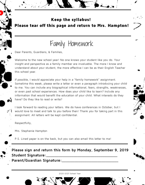
This is a big one that I have done for years. I get my syllabus signed, but don't offer a tear-off portion or a way to keep the syllabus. I want that information readily available to my families. They should keep it. Instead, I am moving to a tear-off page that has signatures for my records, and also gives me vital information (see the picture below).
Mistake #4: You don't reference the syllabus again for a long time.
Particularly, in the first few months of school, I like to talk about the syllabus a lot. I suspect that even though I did this I still had students who didn't understand that pesky pie chart that explained how I calculated their grades. This was just one aspect of the syllabus. Grades and percentages, especially at the middle school level, require teachers to break down this information in a user-friendly manner. Understanding that the writing workshop is 30% of their grade is critical for buy-in and participation, but it also creates an atmosphere of honesty and transparency.
Mistake #5: Your syllabus looks boring.
It is text-heavy and does not attract the eye. It uses no graphics, no charts, and it has no detail.
Regarding mistake #5, many districts assign the template for you in terms of font, programming, etc. While this makes my heart heavy, you can still reflect on the said boring syllabus with mistakes #1-4. If you are allowed to change up how your syllabus looks and you aren't doing anything about it, I would like to offer you a potential solution using Canva.
Using the Canva Design Software
Cue Canva. Canva is a browser-based program that offers document design in an accessible way. They offer a free and paid version, and I have tried both. The free version offers a ton of options for making a fun syllabus that allows you to 1.) spend no money and 2.) engage students. I have used many programs over the past few years attempting to make all of my design documents look better, and I have not found one better than Canva. The main benefits of Canva over competitors (yes, including a word document or google docs) are the following:
Ease of the drag and drop function
Ease of saving as a PDF (some programs you have to save as an image and then move it over to make it into a document that actually prints...I spent 4 hours on this one year)
Variety of graphics and fonts available that are free
Variety of pictures that are free to use
Accessible database that keeps your information
It's free (the paid version is amazing...but not needed for teachers per se)
All of the points above highlight the positives of using Canva, but also highlight the negatives of using other platforms. Here are some of my old syllabi from the same prep that I have handed out:
2013-2014 Syllabus: Used Word (or similar Google Doc/word processing program)
2016-2017 Syllabus: Used a similar program to Canva, but not as user friendly
2017-2018 Syllabus: Used Canva. Took me an hour from start to download to create
2019-2020 Syllabus: Used Canva. Added the family assignment.
Basic Canva Directions
Create/Sign Up for a Canva Account
Click the Create-A-Design button
Scroll down to the documents category
I really like the Letterhead template or the Resume template, but you can try others. Just make sure the size is 8 1/2 X 11.
Start designing!
When you are done, you can download the PDF to print right away.
There are a lot of great resources out there regarding what content to put in your syllabus. I really love the Cult of Pedagogy's post regarding How to Make a Syllabus (and pretty much all of her content). I also use this as a way to make my field trip lists, honor roll flyers, and any class newsletters that I send home. I am also going to jazz up my interdisciplinary team letter this year. Either way, happy syllabus designing! Feel free to tag me at @writingmindset on Twitter or Instagram with any before and afters.

